
More news on this day
Bengaluru’s city map is being quietly but rapidly redrawn, as new metro corridors, ward boundaries and digital mapping tools converge to change how India’s tech hub is understood and navigated.
Get the latest news straight to your inbox!
A Metro Network That Is Redefining the Urban Map
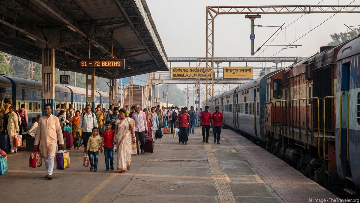
The most visible changes to Bengaluru’s contemporary city map are tied to Namma Metro. Updated route diagrams for 2026 show a three-line operational network spanning more than 90 kilometers, with the Purple, Green and Yellow lines now forming a clear backbone for east–west and north–south travel. Route maps place key interchange hubs such as the city railway station area and central business districts at the heart of a growing radial grid, altering how first-time visitors visualize the city.
Published coverage of the metro’s expansion indicates that the Yellow Line towards Electronic City and Bommasandra has been particularly significant, pulling the city’s perceived edge further south and east. Commuter maps that once ended around traditional inner neighborhoods now extend deep into what were earlier considered peripheral industrial and IT zones. Travel guides and real estate portals have begun using the metro map as a primary reference, sometimes even ahead of conventional road atlases.
Beyond current operations, Phase 3 proposals are already influencing how future maps of Bengaluru are being sketched. Plans for new corridors along the western stretch of the Outer Ring Road and towards emerging suburbs describe a 200 kilometer plus network in the next decade. Even before construction starts, these alignments are appearing in planning documents and investor presentations, giving residents a preview of how the mental map of the city is expected to stretch further outward.
Under-construction lines, including the Pink Line running north–south through dense residential and institutional districts, are likewise present on many updated schematic maps. Although these routes are marked as future or proposed, their inclusion helps travelers and businesses anticipate new catchment areas, changing how they read distance and accessibility across the city.
Administrative Maps Shift With New Ward and Authority Boundaries
Alongside transit diagrams, Bengaluru’s official city outline has been redrawn through changes in its administrative map. The former municipal body’s 198-ward structure has been replaced by a larger set of wards, with recent delimitation exercises taking the total beyond 220 units. Publicly available ward maps now show a more fine-grained patchwork of local jurisdictions, reflecting rapid population growth and densification at the urban edge.
Datasets released by civic-data platforms and references in government notifications detail ward shapes, numbers and names under the latest delimitation. These maps, often built on top of OpenStreetMap base layers, highlight how neighborhoods have been split, merged or renamed. For residents, the redrawn boundaries have altered everything from which local office they approach for services to how they understand their position in the broader city.
At a metropolitan scale, the creation of the Greater Bengaluru Authority has added a new frame to the city’s cartography. Map viewers associated with the new authority depict a larger planning area that stretches beyond the conventional urban core to include fast-growing peripheral towns and rural tracts. These layers distinguish between corporation areas, outer planning limits and adjoining taluks, signaling a shift from a city-only map to a regional urban footprint.
Urban policy commentary notes that these administrative maps are now directly tied to electoral rolls, budgeting and infrastructure planning. As a result, ward and authority boundaries are not just technical lines on a page but active tools that decide where road upgrades, drainage works and public amenities are prioritized across the metropolis.
Digital GIS Platforms Put Detailed City Layers in Public View
Increasingly, Bengaluru’s map is being mediated through digital tools rather than paper sheets. Municipal tender documents and budget notes refer to the rollout of a comprehensive GIS-based master plan for the Greater Bengaluru area, along with large-scale digitization of property records. These systems rely on high-resolution base maps, cadastral overlays and infrastructure layers that can be toggled on demand by planners and engineers.
Public-facing GIS viewers have also emerged as a key way for citizens to see the city’s geography. Interactive portals allow users to zoom from a metro-line schematic down to individual plots, storm drains and street segments. Some platforms incorporate aerial imagery from drone surveys, giving more accurate and recent views of built-up areas than older satellite tiles. For the first time, many neighborhoods can be explored as layered, data-rich map stacks instead of static drawings.
Open-data initiatives and independent civic groups have pushed these developments further by releasing downloadable ward shapefiles, electoral maps and infrastructure datasets. Enthusiast communities have used this material to create their own thematic maps, including visualizations of tree cover, water stress and transport projects. These overlays sit atop the same underlying city grid, revealing how diverse issues intersect spatially in Bengaluru.
The combined effect is that the city no longer exists as a single authoritative map but as a constellation of interactive cartographic views. Travelers, residents and analysts can choose between transit layers, administrative boundaries, environmental indicators or real-estate heatmaps, each telling a slightly different story about how the city is structured.
Wayfinding, Heritage Streets and Neighborhood-Level Mapping
On the ground, Bengaluru’s map is also changing in more granular ways through wayfinding and streetscape projects. Design and planning firms have documented efforts to rework key commercial and heritage streets with standardized signage, pedestrian-friendly layouts and clear directional cues. In such areas, the physical arrangement of signboards, street names and public information panels acts as a live extension of the city map for people walking, cycling or using public transport.
Neighborhood development projects in older markets and residential quarters have introduced consistent visual languages for signages, often featuring bilingual or trilingual text and icons. These interventions make it easier for visitors to orient themselves without relying solely on digital navigation, while also reinforcing local identity by highlighting historic names and landmarks that might be obscured on minimalist online maps.
Large townships, tech campuses and gated communities across Bengaluru similarly commission internal wayfinding systems. Although these layouts are sometimes absent from public mapping apps, they function as micro-maps that sit within the broader urban fabric. Campus maps, block plans and amenity directories provide an additional layer of spatial information that residents and office workers consult daily.
Collectively, these neighborhood-scale efforts contribute to a more legible city, especially for those who move primarily on foot or by bus. The interplay between formal street signage, informal markers such as landmarks and shops, and digital turn-by-turn directions shapes how people experience the map of Bengaluru in everyday life.
Residents, Planners and Visitors Read Different Maps of the Same City
The accelerating reshaping of Bengaluru’s map has created different but overlapping ways of seeing the city. Long-time residents often rely on an internal mental map organized around traditional localities, lakes and junctions that predate current administrative lines. For them, a new metro station or ward boundary can feel like an overlay on a deeper, historically rooted geography of markets, temples and neighborhoods.
Urban planners and transport agencies, by contrast, work primarily with GIS layers, density maps and network diagrams. Their versions of the city highlight corridors, catchment zones and planning cells, and tend to flatten local nuances in favor of region-wide patterns. Decisions about where to extend metro lines or redraw wards are based on these analytical maps, which are rarely seen in full detail by the broader public.
Visitors and new migrants, meanwhile, increasingly encounter Bengaluru first as a digital interface. Journey planners, ride-hailing apps and short-term rental platforms present a simplified schematic of roads, transit lines and points of interest. In this view, the city is a collection of connectivity nodes, travel times and ratings, more than a layered historical landscape. Their personal map of Bengaluru is heavily influenced by which parts of the city are well-covered by public transport and digital services.
As metro expansion, administrative reforms and digital mapping continue, these different cartographies are likely to converge in some areas and diverge in others. What is clear from recent developments is that Bengaluru’s city map is no longer a static backdrop. It has become a dynamic, contested and constantly updated instrument that both reflects and shapes the region’s rapid urban transformation.