
More news on this day
Tourists landing in Philadelphia this summer are encountering a city that is quietly remapping itself, with fresh wayfinding signs, transit diagrams and digital tools changing how visitors move between historic sites, museums and emerging neighborhoods.
Get the latest news straight to your inbox!
Center City Street Maps Get a Modern Refresh
In the dense core of Philadelphia, familiar green and black wayfinding pylons are being joined by updated signage and mapping aimed at pedestrians. Publicly available information from Center City organizations shows that the long running “Walk Philadelphia” map system, which plots major attractions and walking routes, is in line for a comprehensive refresh covering downtown streets from the Delaware River to West Market and beyond. The initiative reflects a broader push to make paper and on-street maps easier to read for first time visitors while remaining useful for daily commuters.
Documents describing the current system indicate that more than 250 pedestrian disk maps are already installed around Center City, giving passersby a simple, neighborhood scale overview of key destinations and landmarks. The maps divide downtown into color coded districts, a design intended to help people build a quick mental picture of where they are in relation to sites such as Independence Hall, City Hall and the Benjamin Franklin Parkway. Planners are now working on a new master plan that keeps this neighborhood logic, but looks to standardize symbols, fonts and arrows so that signs are consistent from block to block.
Reports from local business improvement groups suggest that the updated program will also reconsider how information is layered on each sign. Instead of crowding every point of interest into a single panel, newer concepts favor a hierarchy that highlights major anchors, walking times and simple north oriented layouts. The goal is for visitors emerging from a hotel, regional rail station or parking garage to understand in seconds which way to turn for the historic district, the Parkway museums or the retail corridors of Walnut and Chestnut streets.
These on street changes are arriving as tourism agencies continue to publish printable downtown maps for trip planners. City travel sites are promoting a detailed Center City map that pairs with separate diagrams for transit and visitor shuttles, signaling that the paper map remains a companion to digital navigation rather than a relic of it.
Transit Diagrams Recast the City for Riders
Beneath the street grid, Philadelphia’s transit network is also being redrawn in cartographic form. Southeastern Pennsylvania Transportation Authority has spent several years developing a “SEPTA Metro” wayfinding concept that simplifies the tangle of subway, elevated, trolley and regional rail services into a color coded metro style diagram. Project materials and outreach summaries describe an interactive map and a family of new line names intended to clarify routes for occasional riders and visitors.
The new mapping language treats the Market Frankford Line, Broad Street Line, trolleys and key rail branches as a legible rapid transit network, with each service assigned a letter and distinct color. Public presentations on the wayfinding effort note that one aim is to make it easier for a tourist with limited time to understand, for example, how to ride from Old City to the stadium district or from University City to the art museums using a combination of lines and transfers. The interactive map allows riders to explore frequent bus routes and future network changes alongside fixed rail services.
Alongside these systemwide diagrams, the agency has been upgrading station level maps, particularly in the downtown concourse that links City Hall, Suburban Station and the Market East area. Design firms involved in the project describe new supergraphics and directional signs that distinguish concourse corridors and highlight exits to major streets. These maps aim to reduce confusion in one of the most complex underground pedestrian networks in the United States, where several rail modes intersect beneath Center City.
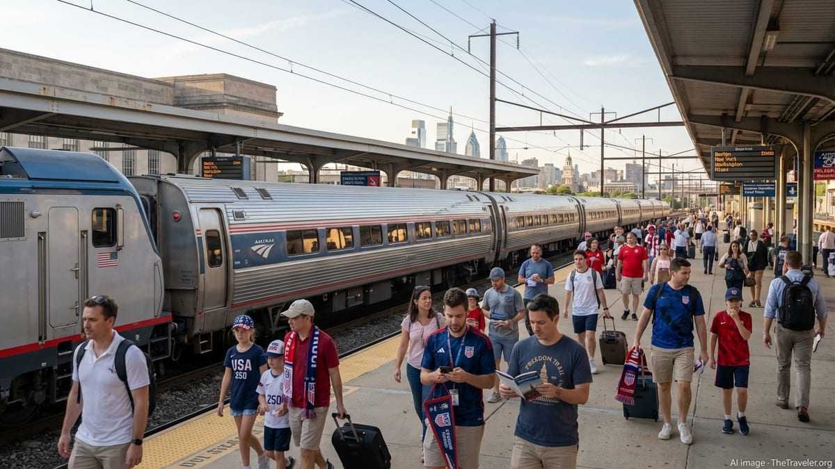
Transit mapping is also responding to short term demands. As Philadelphia prepares to host international soccer matches in 2026, travel advisories and planning presentations outline special diagrams showing extra train service, shuttle routes and walking connections around the South Philadelphia sports complex. For visitors arriving specifically for match days, these focused maps may become their primary mental picture of the city.
Visitor Shuttles and Scenic Corridors Put Landmarks in Context
Above ground, a separate layer of mapping is devoted to visitor friendly circulator services and cultural corridors. Tourism agencies publish a dedicated city map for the PHLASH bus, a seasonal shuttle that loops between the Delaware waterfront, Independence Mall, City Hall and the museums along the Benjamin Franklin Parkway. The route schematic highlights stops at popular attractions such as the Philadelphia Museum of Art, the Barnes Foundation and the zoo, providing a straightforward visual guide for travelers who would rather hop on and off a single service than interpret the full transit system.
Recent PHLASH materials for the 2026 season show stops stretching from Old City west to Fairmount Park and north toward the Parkway, effectively turning the bus into a moving orientation tour. The route map is designed less as a technical diagram and more as a sightseeing overview, with landmarks emphasized and street names simplified. For many visitors, this becomes their functional “city map” for a day of museum going and waterfront walks.
City sponsored neighborhood programming is also influencing how maps are framed. Public information on new guided walking tours highlights a series of neighborhood hubs, often reachable on foot from Old City or Center City hotels. These initiatives encourage visitors to think of the city not only as an axis between Independence Hall and the art museum, but as a cluster of walkable districts stretching toward Northern Liberties, South Street and West Philadelphia.
By pairing shuttle route diagrams, walking tour brochures and on street maps, officials and partner organizations are trying to convey both distance and density. A landmark that looks distant on a region wide map may be only a short bus ride from the historic core, while a compact downtown block grid can feel larger than it is without clear indications of walking times and transit intervals.
Digital Mapping and the Rise of the Pedestrian Portal
Beyond printed brochures and metal signs, Philadelphia is increasingly mapped in pixels. Regional planners at the Delaware Valley Regional Planning Commission have built a public pedestrian portal that displays sidewalks, crossings and curb ramps across the metropolitan area. The online map allows users to explore where pedestrian infrastructure is continuous and where gaps remain, offering a level of detail that traditional city maps rarely provide.
Background materials on the portal explain that the dataset is a work in progress, assembled from aerial imagery and local knowledge, and that residents can help correct and update features over time. For visitors who rely on screen readers, mobility aids or simply an interest in walkability, these tools offer another layer of navigational insight, especially in areas beyond the central tourist districts.
The growth of digital maps has also changed how travelers interact with physical signage once they arrive. Instead of replacing on street maps, smartphone navigation tends to complement them, with many tourists checking a city map panel for overall bearings before switching to a mapping app for turn by turn directions. Tourism advice circulated on local channels often notes that, within Center City, most major attractions fall within a compact, walkable grid, something that can be easier to appreciate on a static map than a zoomed in phone screen.
At the same time, digital transit planners and open data feeds mean that SEPTA system maps are now as likely to be viewed on a phone as on a station wall. Updated diagrams that use line letters, consistent colors and simplified geography are intended to hold up equally well in a small digital window and on a large format poster, reflecting a shift in how and where city maps are consumed.
A City Preparing Its Maps for 2026 and Beyond
Multiple strands of mapping work are converging as Philadelphia looks toward a high profile tourism year. The upgrade of downtown pedestrian signs, the rollout of SEPTA’s new wayfinding scheme, the publication of refreshed shuttle diagrams and the continued expansion of digital pedestrian tools are all timed to present a clearer picture of the city to new arrivals.
Budget documents and local press coverage show that municipal leaders have recently protected funding for transit initiatives while supporting projects that improve riders’ access to stations and stops. New facilities such as an updated intercity bus center near Market East come with their own family of maps and signs, designed to plug long distance coach passengers directly into the downtown street grid and nearby rail lines.
For travelers, the cumulative effect is a more legible city. Historic lanes in Old City, the skyscraper canyons of Market Street, the cultural lawns of the Parkway and the stadium plazas in South Philadelphia are now stitched together by a network of signs, diagrams and digital tools that share a common visual language. As the 2026 travel season unfolds, Philadelphia’s evolving city map is becoming not just a way to get from one attraction to the next, but a statement about how the city wants to be seen.