
More news on this day
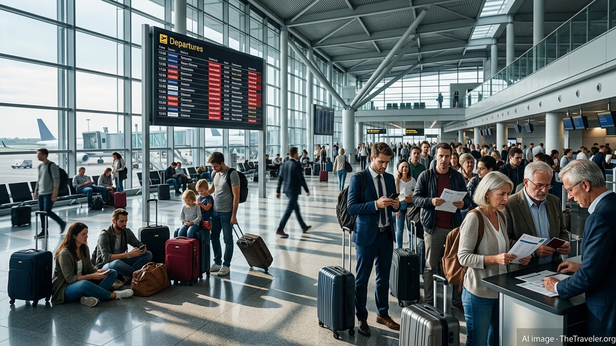
As another summer of congested terminals, system outages and airspace disruptions bears down on Europe, Eurowings has unveiled a sweeping brand and design transformation that aims to make navigating its network feel simpler and less stressful for millions of passengers.
Get the latest news straight to your inbox!
From Low Cost Carrier to “Value Airline” for a Strained Market
The latest overhaul caps a multiyear shift in which Eurowings has repositioned itself from a traditional low cost carrier toward what it describes as a European “value airline.” Publicly available company information indicates that the carrier is placing greater emphasis on comfort, flexibility and reliability while still competing on price, a strategy designed to appeal to travelers worn down by years of disruption across the continent.
Traffic data from the Lufthansa Group’s recent financial reporting shows that Eurowings has already expanded significantly, carrying close to 23 million passengers in 2024 and operating well above its pre pandemic capacity. The expansion has unfolded against a backdrop of recurring bottlenecks at major European hubs, tight staffing, airspace constraints and periodic IT incidents that have repeatedly tested airlines’ resilience.
Industry coverage notes that Eurowings’ redefined positioning centers on the brand promise of “more ease for everyone,” an explicit nod to passengers who increasingly value predictability and friction free journeys as much as headline ticket prices. The new brand architecture is framed as a way to turn that promise into visible, tangible elements throughout the travel chain rather than leaving it as a marketing slogan.
Analysts point out that this strategic pivot reflects wider European trends, as carriers attempt to hold on to price conscious customers while differentiating themselves from ultra low cost rivals whose bare bones offerings can feel ill suited to a more volatile operating environment.
New Corporate Design Targets Clarity Across Every Touchpoint
The most visible aspect of the shift is a new corporate design introduced in late June 2026. According to the airline’s own communications and aviation industry reports, Eurowings has simplified its visual identity into a digital first design system intended to work consistently on mobile apps, websites, airport signage, inflight materials and advertising.
The redesign places the stylised “wings” symbol at the center of the visual language, supported by a refreshed color palette and a cleaner logo execution. A new proprietary typeface, Eurowings Type, has been developed to improve legibility in crowded, information heavy environments such as departure boards, boarding passes and mobile screens.
Brand specialists quoted in trade coverage say such simplification is not merely cosmetic. In a context where travelers are frequently rebooked, re routed or confronted with sudden schedule changes, quickly readable information can help reduce confusion and perceived chaos at key decision points like check in, security, boarding and transfers.
Eurowings presents the redesign as a way to ensure that its brand remains recognizable and coherent even when customers encounter it through third party channels, partner airlines or congested airport infrastructure, potentially helping passengers orient themselves more easily when itineraries do not go as originally planned.
Designing for Disruption: How the Brand Touches the Journey
Alongside the refreshed visuals, Eurowings is gradually extending its brand into what it describes as “special moments” along the travel chain. Company announcements over the past two years highlight measures that range from updated onboard aesthetics to new service elements and partnerships intended to create a calmer, more human feel during the trip.
The airline has pointed to its mobile and digital platforms as critical tools when operations become irregular. A more consistent visual system, combined with simplified typography, is being presented as a way to make push notifications, rebooking options and service updates more understandable when passengers are dealing with delays or last minute gate changes.
Observers note that this emphasis on clarity responds directly to recent episodes where IT failures and air traffic control issues cascaded across European networks, affecting check in, baggage handling and flight operations. During such events, travelers often report that poor communication can be more frustrating than the disruption itself, making clear, branded information a key part of perceived reliability.
By investing in design elements that carry through from marketing to day of travel tools, Eurowings appears to be betting that a predictable, easily recognizable interface can help passengers stay in control even when broader system pressures are beyond any single airline’s direct influence.
Marketing Campaigns and Brand Extensions Build Emotional Cushion
The visual overhaul builds on a marketing campaign launched earlier in the brand realignment that leaned into humor and a lighter tone to differentiate Eurowings in a crowded European market. The campaign, which introduced the tagline built around travelers “loving to fly,” sought to portray the airline as approachable and self aware at a time when frustration with air travel logistics was running high.
Subsequent initiatives, including an online fan store and lifestyle themed branded products, have extended the Eurowings identity beyond the aircraft cabin. According to company statements, these steps are designed to deepen emotional ties and present the airline as a familiar, even playful, presence in daily life, in contrast to the stress many associate with airports and peak travel seasons.
Marketing analysts suggest that cultivating this lighter brand personality can help buffer customer sentiment when operational issues inevitably arise. While such efforts cannot prevent delays or cancellations, a brand that feels more human and consistent may retain more trust when passengers need flexibility, support or compensation during disruptions.
In parallel, Eurowings has highlighted reliability focused moves such as fleet modernization, new seat products on short and medium haul routes and closer integration with partner airlines through codeshares and interline agreements. These operational changes underpin the brand promise by expanding options for re accommodation and improving the onboard experience when flights do operate as scheduled.
Implications for Travelers Facing a Volatile European Summer
For travelers, the transformation will be most visible over the coming seasons as the new design gradually appears on aircraft, at airports and in digital channels. Aviation reporting indicates that brand elements on board, in lounges and at gates will be refreshed step by step, meaning passengers will encounter a mix of legacy and updated visuals for some time.
Consumer advocates caution that while a clearer, calmer brand environment can improve wayfinding and reduce stress, it is not a substitute for robust operations, sufficient staffing and resilient IT systems. The true test of Eurowings’ new identity will come during peak holiday periods and unexpected disruptions, when passengers rely heavily on accurate, timely information and practical support.
Industry observers also point out that the competitive landscape is tightening. Other European carriers are revamping their own brands and products, and low cost rivals continue to expand aggressively. In this environment, Eurowings’ bid to occupy a middle ground, offering more comfort and flexibility without abandoning value pricing, will depend on whether travelers see the new brand as matched by consistently dependable performance.
For now, the airline’s latest moves signal that branding and design are being treated as frontline tools in managing the perception of chaos that has dogged European aviation in recent years. If the strategy succeeds, passengers heading into another uncertain summer could find that at least one aspect of their journey feels a little more navigable.